(This guide is adapted from DJI.)
The histogram is a tool that can help you get correct exposure.

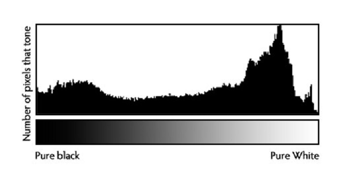
A histogram is a visual representation of pixel exposure in your image. The left side of the graph represents the darkest parts of the image, also known as shadows, and the right side represents the brightest parts of the image, also known as highlights. The middle section represents mid tones. The Y-axis represents the number of pixels exposed in a particular tone. The higher the graph goes at a given point, the more pixels are exposed at that particular light level.

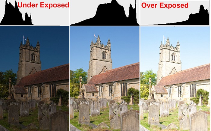
The histogram shows how over or under exposed an image is. The picture below shows histograms for over, under and well exposed images.

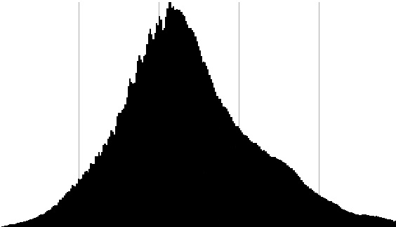
Generally, you don’t want your image to be too overexposed or underexposed. An ideal histogram looks something like the one below. There is a bulge in the midtones, and it tapers downward on the left and right.

However, your histograms won’t always looks like this, depending on what you are shooting. For example, say you’re shooting a sunset with a building in the foreground. This is a high-contrast shot, so you will likely see the histogram bulge in the shadows and highlights (see left histogram below).

Beware of clipping. Clipping is where details in a photo or video are lost because of serious overexposure or underexposure. If your histogram looks like the Overexposed or Underexposed examples above (the peaks are clipped either on the left or on the right margin), you need to adjust your exposure settings. If the histogram indicates that your images will be overexposed, close the aperture, increase the shutter speed, or reduce the ISO setting. The opposite adjustments need to be made if your the histogram indicates that your images will be underexposed.
In very high contrast situations, it may be impossible to find exposure settings that avoid both under- and overexposure. In this case, you will have to decide whether the highlights are more important or the shadows and expose accordingly. When you capture a cell tower, for example, the highlights are always more critical, so make sure that the highlight peak (near the right margin in the histogram) is fully within the diagram (i.e. not cut off at the right margin).
